SChoep’s Ice Cream
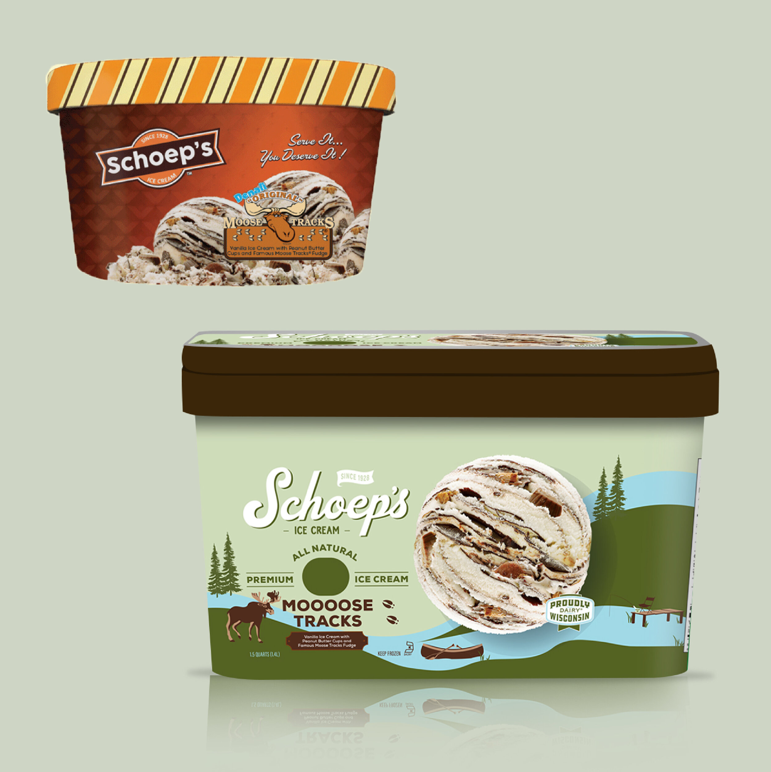
Schoep’s Ice Cream is a Wisconsin family-owned company that has been around for over 90 years. Schoep’s was looking into a very large rebrand for their ice cream containers. Their deliverable was to create a fresh illustrated look that conveyed their Wisconsin roots. Schoep’s approached me due to my strong illustrative style. I rebranded their three specialty ice creams, Peppermint Stick, Moose Tracks, and Badger Tracks.
New look is now live: https://schoepsicecream.com/
Design Process
My design process began with research on Wisconsin. Looking at the iconic lodges, summer camp-like signage, winter activities, and landscape.
I sketched and presented the company with this first prototype design. That they quickly fell in love with.
The design was able to embody what they were looking for and ultimately decided would be perfect for their three specialty flavors.
Concepts for each flavor began to build.
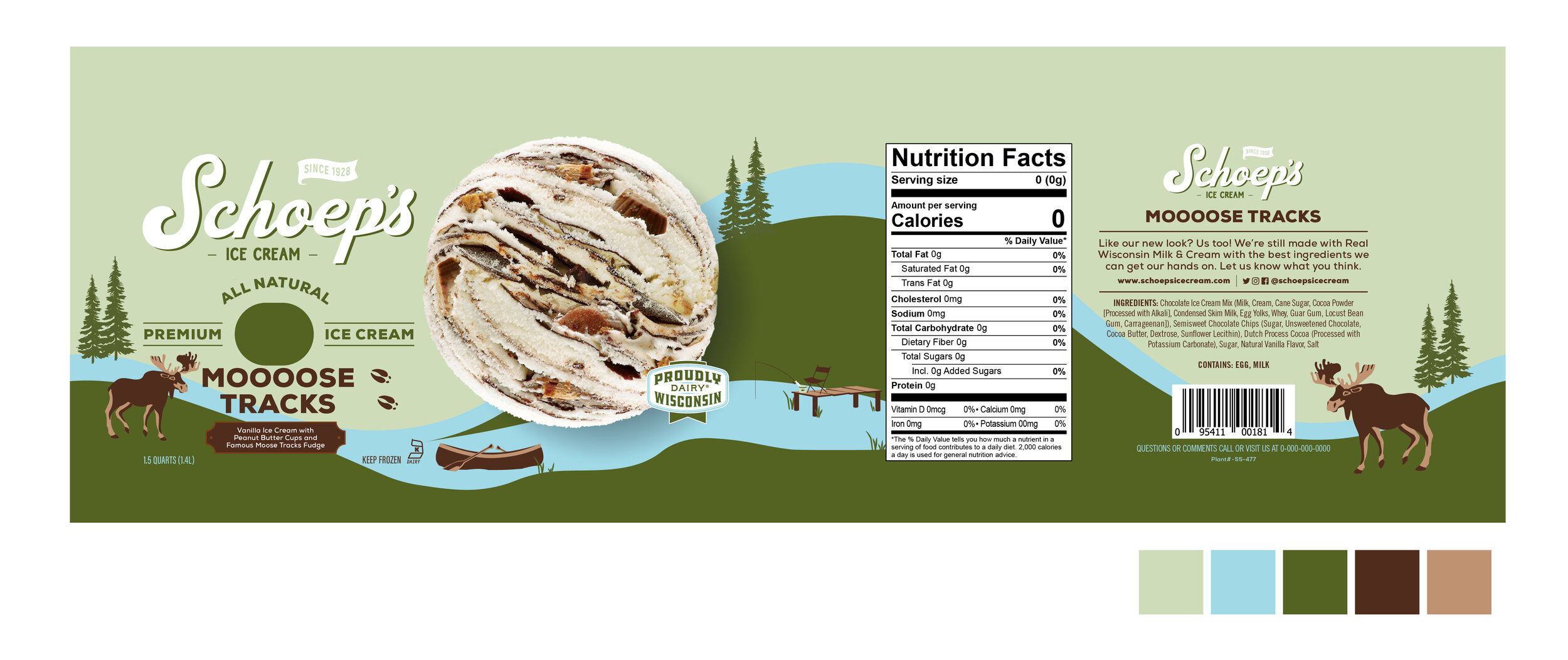
Moose Tracks
For Moose Tracks, I was inspired by Wisconsin summers filled with adventures at the lake, fishing, boating, and thriving wildlife. I changed the color scheme into organic blue, green, and brown reminding the customer of Schoep’s Ice Cream local family-owned roots.
Badger Tracks
For Badger Tracks, the University of Wisconsin-Madison was the focal point. I illustrated iconic buildings such as the football stadium and Bascom Hall along with Wisconsin’s Badger Mascot. These items gave the package design energy to support local.
Peppermint Stick
For Peppermint Stick I embraced the Wisconsin slopes providing playful peppermint hills filled with peppermint sticks, skis, and the iconic Wisconsin Capital building.
Other design options included a more abstract pattern design, and snow scene illustration design. Both of these designs were presented to my client. These were part of my design proposal for the rebrand, from here edits were made to complete the final three rebrand look and feel.


